It's a small selection of my work that can be shared with the public
When I started as Technology trainee as part of the Benelux traineeship program of Philips, my first assignment was Lumea. I worked on the user interface of the high end Lumea prestige models as well as the low end Lumea essential series.
During this time I created 3D printed, arduino based, bluetooth connected, prototypes of the products to test the user interface design and behavior with real users, incorporated their feedback in the final product and worked with all stakeholders involved, from embedded software to design, to make sure all end-user needs were met.
Next to this I joined the Lumea app team, in a small team of 5 members we researched what the user needs in a Lumea App experience and build a quick prototype to test with consumers and after this iterative process of improving the experience.
The key take away in this process was keeping it simple, the main customer pain was forgetting to use the device, since the device is only used every three weeks. Therefore the main functionality of the app was to automatically calculate the users schedule, and automatically calculate when a new initial phase with more intense sessions is needed, for example when to many sessions were skipped.
Resulting in the app experience visible below.
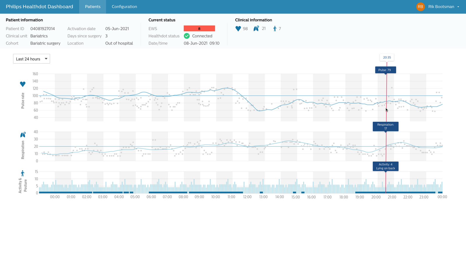
This project is quite indicative of the projects I've been working on within Philips. This is an application, that shows data of a Philips Healthdot, which captures heart rate, respiration rate, activity and posture data every 5 minutes from the patient and sends this wirelessly via an LoRa IOT network to the cloud. To deliver this dashboard application I had the role of senior product owner, responsible for the requirements definition, the design of the application as well as documentation.
This project allows the healthdot hardware product to be standalone and not rely on external visualization software only, allowing medical staff to get started quickly with a cloud native application and experience the benefits for their patients as quickly as possible, without installing on premise architecture. The configuration of the application, the view settings and algorithm development were also part of this project, but can't be shown here.
Project not yet launched in production with customers, but used currently in customer demo environments.
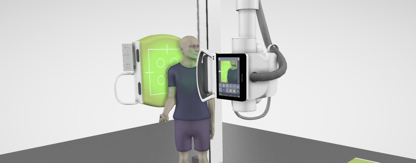
In Philips, especially in innovation and research, it takes some time before your work makes it to the market, this is one of the recent projects that is already online. The Philips Learning Academy https://www.learningacademy.philips.com/ is an online portal where radiologists working with Philips products can follow online trainings and sign up for in person training to keep their knowledge on par. Next to that a 3D interactive viewer is integrated in the application to allow radiologists to virtually scan a person in different positions and see the 3D model of the patient next to the scan, to better understand the scan. You can make an account on the website for free and try out the free to use features if you like!
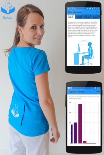
In this project I focused on lower back pain prevention for nurses. The main goal was to create a minimally intrusive design, which is comfortable to wear throughout the day. The designed shirt is able to give feedback on the posture via activity tracking.
The final design was a shirt which can be worn for several hours by nurses which connects via bluetooth 4.0 to the mobile phone of the user. The complete system was integrated in the shirt with an embroidered electronic circuit to connect the sensors, battery and the bluetooth module.
The system was validated in a trial (n=15) in which we found that the participants were motivated to use the shirt. This trial was based on short usage of two hours, further research is necessary to completely validate the design.
During the development of the smart shirt reproducibility was important. How to mass produce these kind of wearables in the future was one of the questions that got attention. This resulted in the project being picked up by the industry to further develop this product.
BackUp was featured on the Dutch Design Week 2015 as well as in the media, see also awards and recognition
Using a new active cold plasma technology we designed a therapeutic slipper which treats diabetic feet. 20 000 people in the Netherlands with diabetes type II, suffer from diabetic feet, which can cause wounds on their feet and may lead to amputation. This therapeutic slipper allows patients to treat their feet at home, in only a few minutes per day. With this active treatment, both wounds and amputation can be prevented. Other treatments must be performed at a clinic and may take up to 6 hours a day. These alternative treatments may include casting the patient’s feet in a plaster cast or submerging the patient in a hyperbaric oxygen tank for several hours a day. The therapeutic slipper enables diabetic patients to keep their feet healthy without losing much time or mobility by allowing them to administer treatment themselves in the comfort of their own home.
The slipper is made to resemble a conventional shoe, to ease the interaction between this cutting edge technology and the patient. The treatment starts automatically when the patient tightens their slipper around their foot. The new cold plasma technology within the shoe will disinfect and cure small wounds on the feet. After the treatment is completed a visual cue informs the user they have to remove the slipper. The technology used in this slipper is based on new research within the Eindhoven University of Technology about cold plasma technology.
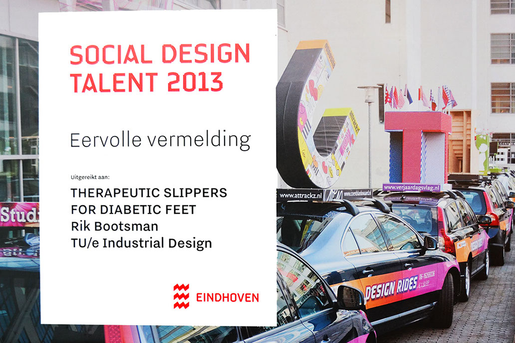
This project was nominated for the Social design talent award and received an honorable mention
Jury review in dutch: In het ontwerp is een grote sprong in denken waar te nemen. Er wordt een klik gemaakt tussen verschillende domeinen. Het idee heeft weliswaar raakvlakken met WMO (kwaliteit van leven, zelfredzaamheid) maar mogelijke doorontwikkeling van dit product is niet aan gemeente. Zeer wel een eervolle vermelding waard.
Colors do not exist. They exist only in our minds and are the result of complex processes of observation, comparison and adjustment. On a carpet of 240 meters long we demonstrate that you cannot believe your eyes. By changing the color of the lighting, immense patterns come to life. See how totally different colors can suddenly appear as one. Experience how red is not so red at all and suddenly can look as if it is yellow. Discover why it is that butterflies and bees can see things we cannot see. IRIS was developed in a four week masterclass of OPENLIGHT, the creative lab of the Intelligent Lighting Institute of the TU Eindhoven, with six students of Industrial Design at TU/e.
GLOW! gave me the opportunity to work in a large team and explore experience design as well as designing and actually delivering a working installation. This in combination with a client, which also needs to be satisfied with the result. Was altogether a complete design process in four weeks. This was also the reason I signed up for this module and showed me that I can work really good under pressure, make quick decisions without losing the reasoning to make the decision and work in a group and keep everybody on the same page. Experience design was a very interesting area to look into, I became aware of the large spectrum of details which needs to be considered to create the perfect experience. This understanding I can use in designing more involving product experiences. It’s not just a product which people use, but the experience of using the product and everything around it. No matter how little influence I have on these details it will influence my design. Being aware of this will improve my designs.
Realizing a complete installation was for me the most impressing part of this activity. The 53000 visitors who were very enthusiastic is an amazing feeling and definitely worth all our hard work.
Overview of awards and recognition
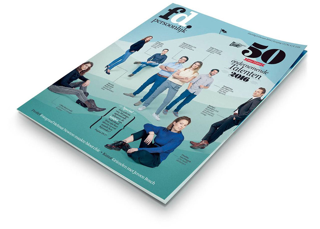
as selected by Financieel dagblad(young entrepreneurial talent 2016 by Financieel dagblad- a financial newspaper in the Netherlands) In 2016 I was selected as young entrepreneurial talent of 2016 together with 49 other talents by "Financieel dagblad persoonlijk" Together with the other talents there are regular network events which I try to attend as much as possible. You can find the article in Dutch here.
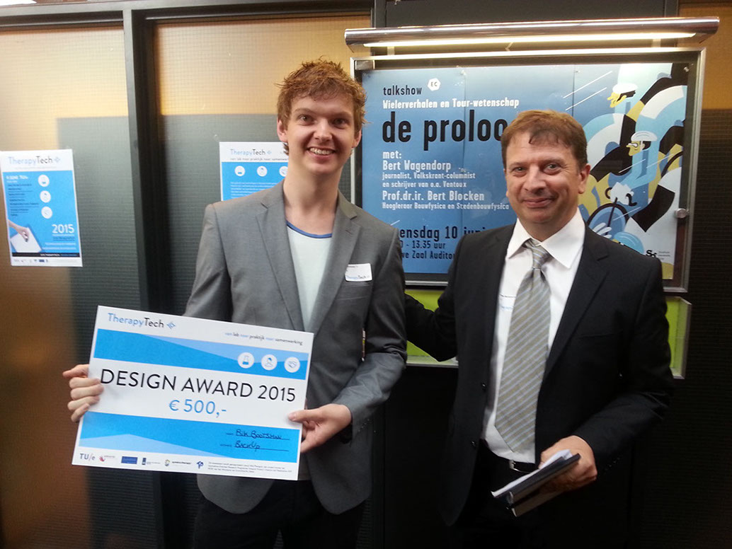
I participated in TherapyTech during my graduation semester. During this event researchers, companies and therapist try to find an answer on how to use technology for therapy purposes. I was asked to showcase my graduation project BackUp at this exhibition and gave live demos of the system. I also participated in the design challenge. With BackUp I won the TherapyTech design award 2015. The feedback from the jury was that BackUp feels like a finished product, which is ready for market. The aesthetics are great and the function and need for this from the field is really apparent.
BackUp was featured on the Dutch Design Week 2015 on the exhibtion Mind the step.
During this period BackUp was also covered in a news item at RTL nieuws as well as in a radio item.
During the dutch design week 2013 I exhibited my work on the therapeutic slippers and was nominated for the social design talent award. More information about this project can be found on the page portfolio. Jury comments (dutch only):In het ontwerp is een grote sprong in denken waar te nemen. Er wordt een klik gemaakt tussen verschillende domeinen. Het idee heeft weliswaar raakvlakken met WMO (kwaliteit van leven, zelfredzaamheid) maar mogelijke doorontwikkeling van dit product is niet aan gemeente. Zeer wel een eervolle vermelding waard.